I have switched from Gnuplot to Matplotlib for a while. For future reference, I decide to organize nodes from my experience of using Matplotlib. matplotlib.pyplot is a collection of command style functions that make matplotlib work like MATLAB. This article presents basic steps for plotting a figure.
1. Figure and axes
pyplot has the concept of the current figure and the current axes. All plotting commands apply to the current axes. plt.gcf() returns the current figure and plt.gca() gets (or create one) the current Axes instance on the current figure.
#!/usr/bin/env python
# -*- coding: utf-8 -*-

import matplotlib.pyplot as plt

cur_fig = plt.gcf()     # returns the current figure (matplotlib.figure.Figure instance)
cur_ax = plt.gca()      # returns the current axes (a matplotlib.axes.Axes instance)

plt.figure(num)         # active the figure `num` (can be integer or string)
plt.sca(ax)             # set the current Axes instance to ax. The current Figure is updated to the parent of ax.

plt.clf()               # clear the current figure
plt.cla()               # clear the current axes
In a very simple way, a figure contains serveral subplots (or axes, an area). The following figure [1] shows the differences among figure, axes and axis.
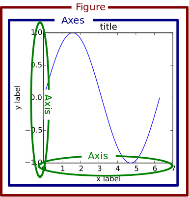
Fig. 1: The differences among figure, axes and axis
2. Create a figure instance
Use plt.figure to create a figure instance. The figure() command is optional because figure(1) will be created by default. Note that the argument num could be integer or string (make the code easier to read).
# Usage
figure( num=None,           # integer or string, optional, default: none
        figsize=None,       # tuple of integers (width, height in inches)
        dpi=None,           # resolution of the figure
        facecolor=None,     # the background color
        edgecolor=None,     # the border color
        frameon=True,       # None or bool, Control whether a frame should be drawn around the legend
        FigureClass=<class 'matplotlib.figure.Figure'>,
        **kwargs)

>>> import matplotlib.pyplot as plt
>>> fig1 = plt.figure(1)
>>> fig2 = plt.figure('fig2')
>>>
>>> fig1.number, fig2.number
(1, 2)
3. Create axes
Each figure can contain many axes and subplots.
3.1 subplots
plt.subplots creates a figure with a set of subplots and returns a tuple of (fig, ax).
# Usage
plt.subplots(   nrows=1,
                ncols=1,
                sharex=False,       # “all”(True), “none”(False), “row”, “col”
                sharey=False,       # “all”(True), “none”(False), “row”, “col”
                squeeze=True,       # if True, extra dimensions are squeezed out from the returned axis object
                subplot_kw=None,    # Dict with keywords passed to the add_subplot() call
                gridspec_kw=None,   # Dict with keywords passed to the GridSpec constructor
                **fig_kw)           # Dict with keywords passed to the figure() call
A demo subplots_demo.py is given in matplotlib.
# Just a figure and one subplot
fig, ax = plt.subplots()

# Two subplots, the axes array is 1-d
fig, axarr = plt.subplots(2)
fig, (ax1, ax2) = plt.subplots(2)

# Four axes, returned as a 2-d array
fig, ((ax1, ax2), (ax3, ax4)) = plt.subplots(2, 2)

fig, axarr = plt.subplots(2, 2)
axarr[0, 0].plot(x, y)
axarr[1, 1].plot(x, y)
3.2 subplot
plt.subplot(*args, **kwargs) returns a subplot axes positioned by the given grid definition.
plt.subplot(nrows, ncols, plot_number)  # typical call signature

plt.subplot(nrows, ncols, plot_number,
            axisbg=,                    # matplotlib.colors, the background color of the subplot, which can be any valid color specifier
            polar=False,                # whether the subplot plot should be a polar projection
            projection= )               # matplotlib.projections, a string giving the name of a custom projection
subplot(111) will be created by default if no any axes is manually specified. A demo subplot_demo.py is given in matplotlib. To have a single axes occupy multiple subplots,
fig2 = plt.figure('fig2')

ax1 = plt.subplot(2, 1, 1)  # plot in the upper half (the figure is only divided into 2*1 = 2 cells)
ax1.plot([1, 2, 3])         # It is the same as `plt.plot` if the figure is active

ax2 = plt.subplot(2, 2, 3)
ax2.plot([4, 5, 6])

ax3 = plt.subplot(2, 2, 4)
ax3.plot([7, 8, 9])
The result is,
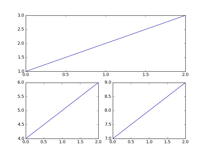
Fig. 2: Multiple subplots occupy a single axes
3.3 add_subplot
fig.add_subplot(*args, **kwargs) is used to add a subplot and returns a axes instance. kwargs are legal Axes kwargs plus projection. Valid values for projection (choose a projection type for the axes) are: ['aitoff', 'hammer', 'lambert', 'mollweide', 'polar', 'rectilinear']. Here are some examples.
fig = plt.figure('fig4')

ax1 = fig.add_subplot(211, axisbg='r')          # fig.add_subplot(2, 1, 1, axisbg='r'), red background
ax2 = fig.add_subplot(212, projection='polar')  # add a polar subplot
4. Plot
Matplotlib could draw bar charts, line graphs, scatter plot graphs, etc.
Line graphs.
plt.plot(*args, **kwargs)(Stacked) bar graphs.
plt.bar. Demo:bar_stacked.py- Pie graphs.
plt.pie. Demo:pie_demo_features.py - Scatter graphs.
plt.scatter. Demo:scatter_demo.pyandscatter_demo2.py - ...
Their APIs are as follows.
# Line graphs
plt.plot(*args, **kwargs)

# Bar or stacked bar graphs
plt.bar(left, height, width=0.8, bottom=None, hold=None, data=None, **kwargs)

# Pie graphs
plt.pie(x, explode=None, labels=None, colors=None, autopct=None, pctdistance=0.6, shadow=False,
        labeldistance=1.1, startangle=None, radius=None, counterclock=True, wedgeprops=None,
        textprops=None, center=(0, 0), frame=False, hold=None, data=None)

# Scatter graph
plt.plot(x, y, 'o')
plt.scatter(x, y, s=20, c=None, marker='o', cmap=None, norm=None, vmin=None, vmax=None, alpha=None,
            linewidths=None, verts=None, edgecolors=None, hold=None, data=None, **kwargs)
5. Show and save
plt.show displays all figures and block until the figures have been close in non-interactive mode.
plt.show(*args, **kw) # block=True or False
plt.savefig(*args, **kwargs) saves the current figure. Here is the typical usage.
# Usage
plt.savefig(*args, **kwargs)
plt.savefig(fname,
            dpi=None,                   # the resolution in dots per inch
            facecolor='w',              # the background color of the figure rectangle
            edgecolor='w',              # the border color of the figure rectangle
            orientation='portrait',     # ['landscape'|'portrait'], currently only on postscript output
            papertype=None,             # one of 'letter', 'legal', 'executive', 'ledger', 'a0' through 'a10', 'b0' through 'b10'. Only supported for postscript output.
            format=None,                # such as png, pdf, ps, eps and svg
            transparent=False,          # if True, the axes patches will all be transparent
            bbox_inches=None,           # Bbox in inches OR 'tight'
            pad_inches=0.1,             # amount of padding around the figure when bbox_inches is 'tight'
            frameon=None)               # if True, the figure patch will be colored

# Demo
fig1 = plt.figure('fig1')
plt.plot([1, 2, 3], [4, 5, 6], 'o')

fig1.savefig('fig1.png')    # save the figure `fig1`
plt.savefig('fig1.pdf')     # save the current figure
References:
[1] StackOverflow: Difference between “axes” and “axis” in matplotlib?
[2] StackOverflow: How to make an axes occupy multiple subplots with pyplot (Python)